
Remember Magic Eye? This trendy art form introduced years ago requires the viewer to “look through” the two-dimensional image in order to pick up on the three-dimensional image ingrained in the pattern. Anyone who has ever attempted this knows it can take some practice, but once you get it you see the image formed in all its detail. It can be pretty amazing. For some people, picking up the 3D image is very easy. Others never really get it because it can be counter-intuitive, and they can’t force their brain to change the way it looks at the image. They can’t help but look at the detail instead of taking a step back to see the big picture.
In a similar fashion, some investors struggle with their own version of failure to see the big picture. They choose to focus in on the minute details (in this case, year-to-year returns) instead of taking in the broader view. The bigger picture tells the real story, demonstrating the value of diversification across asset classes. The chart below is instructive. It is published annually (for free) by Callan, an institutional investment, consulting and research firm (it can be viewed or downloaded at http://www.callan.com/).
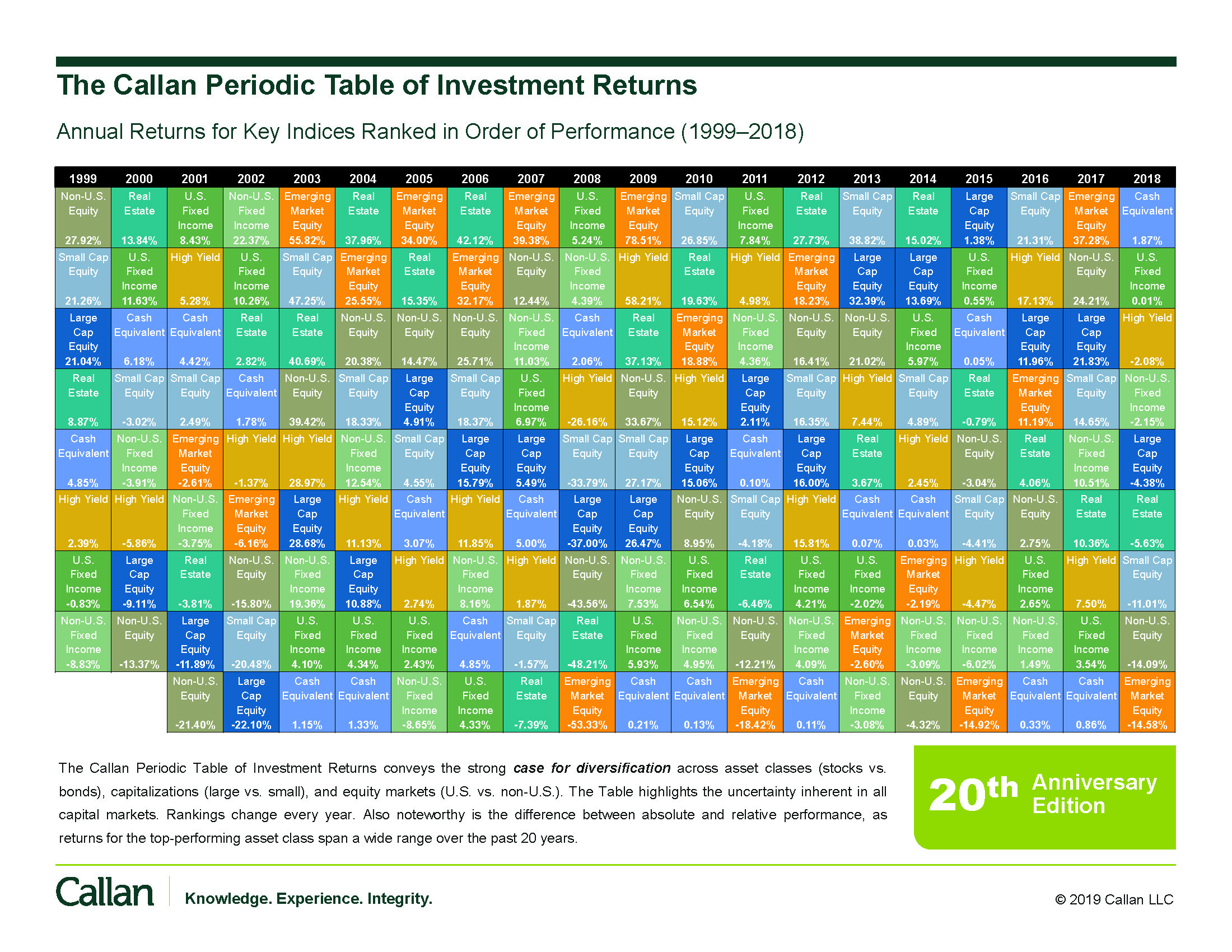 At first glance this looks more like a vision test used by a cruel eye doctor. But instead of straining to read all the details, it’s better to approach the chart like a Magic Eye. The key lesson is learned by taking a step back to view the chart in its totality.
The chart shows nine asset classes and their total return from year to year (1999 – 2018). Each column represents a year, and each column includes the same nine blocks. Each block represents an asset class (growth stocks, high yield bonds, emerging market stocks, etc.) and each asset class is ranked top-to-bottom for that year based on total return.
In the first column, 1999, we see that Non-US Equity (gray box) performed the best (+27.92%) while Non-US Fixed Income (light-green box) performed the worst (-8.83%). After 1999 investors may have been tempted to increase their exposure to Non-US Equity. Those who did learned a painful lesson over the next three years as Non-US Equity was consistently one of the worst-performing asset classes!
As the chart illustrates, trends can quickly reverse, and “past performance is not a guarantee of future results.” A frequent cause of underperformance of real-world portfolios is selling low after an asset class underperforms and buying high after an asset class was a top performer.
Making a “call” on which asset class will perform the best in any particular year is impossible. This is why diversification among many asset classes is critical. It’s also unnecessary. If we were to add a new box for a Diversified Portfolio, we would see that it would consistently finish somewhere in the middle. This is by design. Reducing volatility and providing more consistent returns enables investors to be successful over the long term. In an investment sense, this is truly the way to see the Big Picture.